01
(BRANDING)
BURNING MAN
(01)
BURNING + MAN + PROJECT
2022
Rebranding for a festival/event named BURNING MAN.
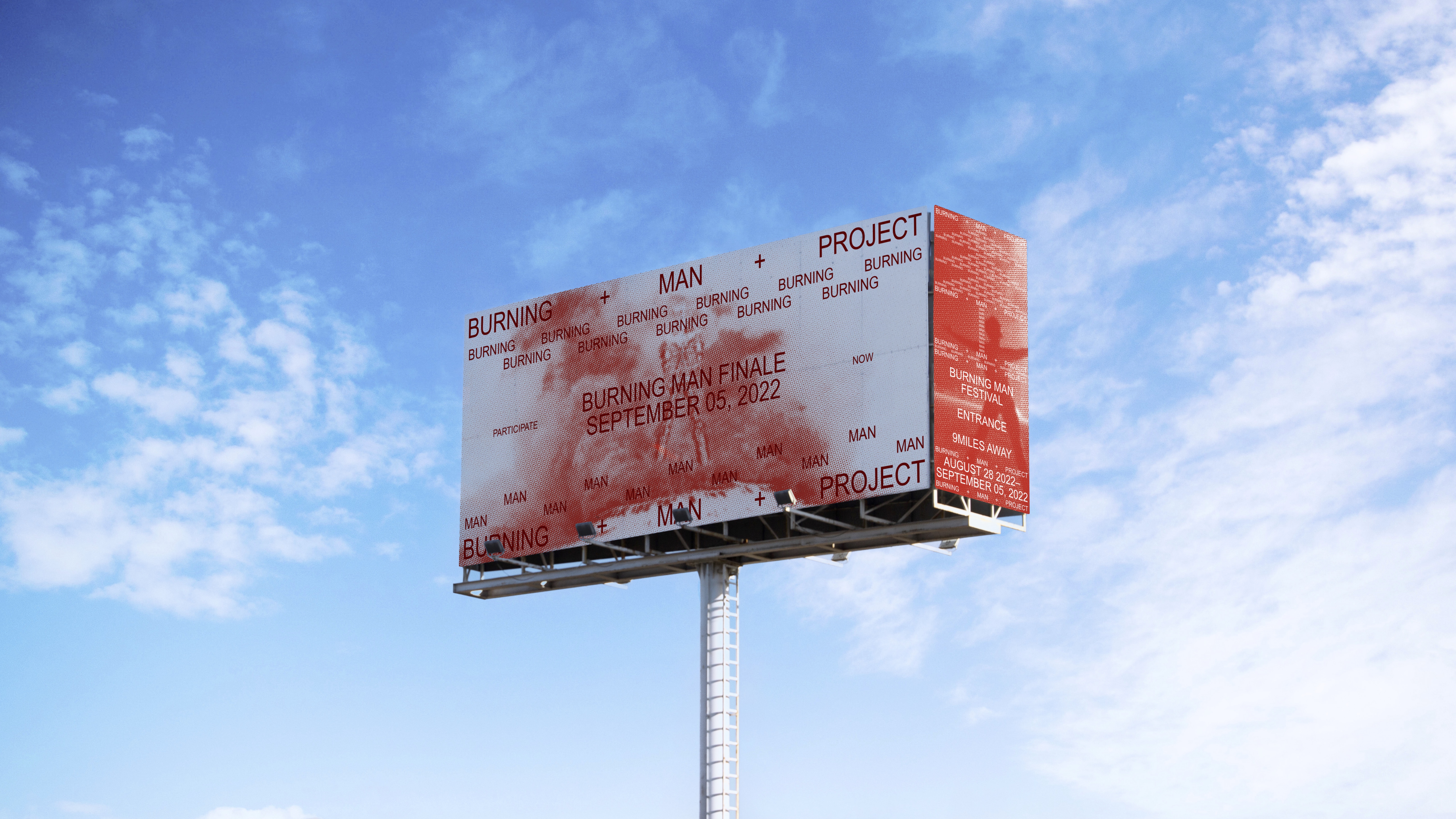
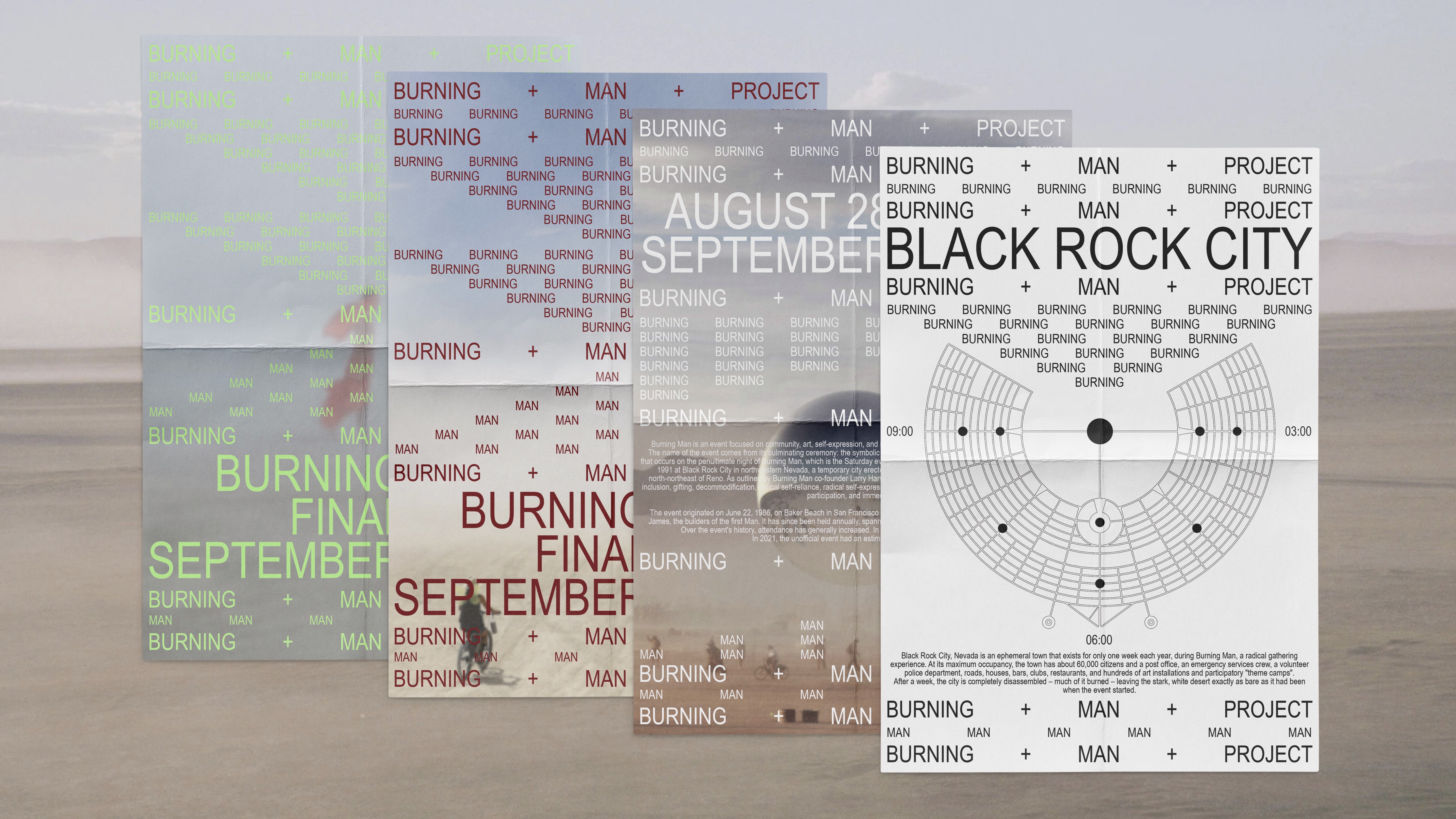
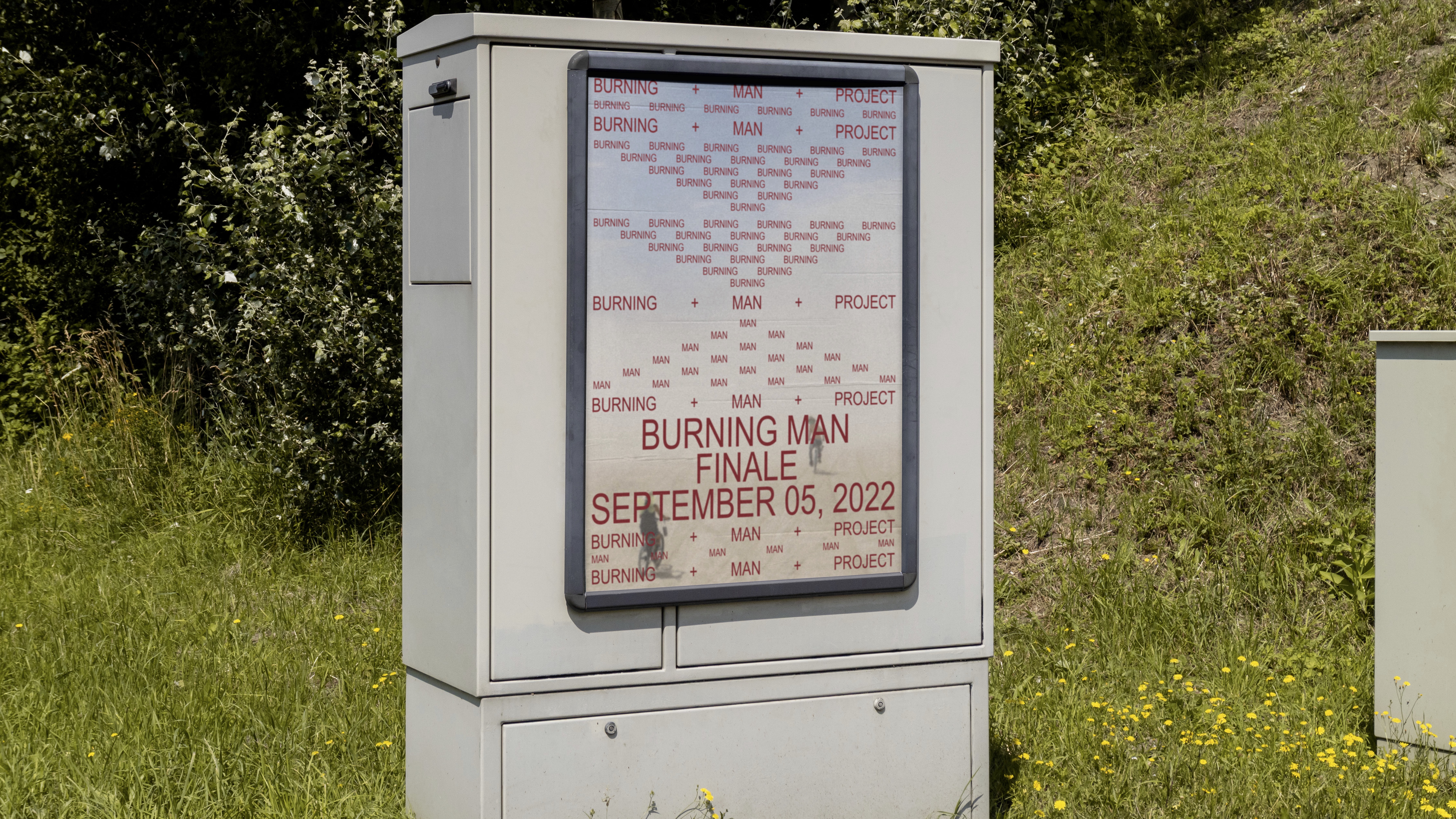
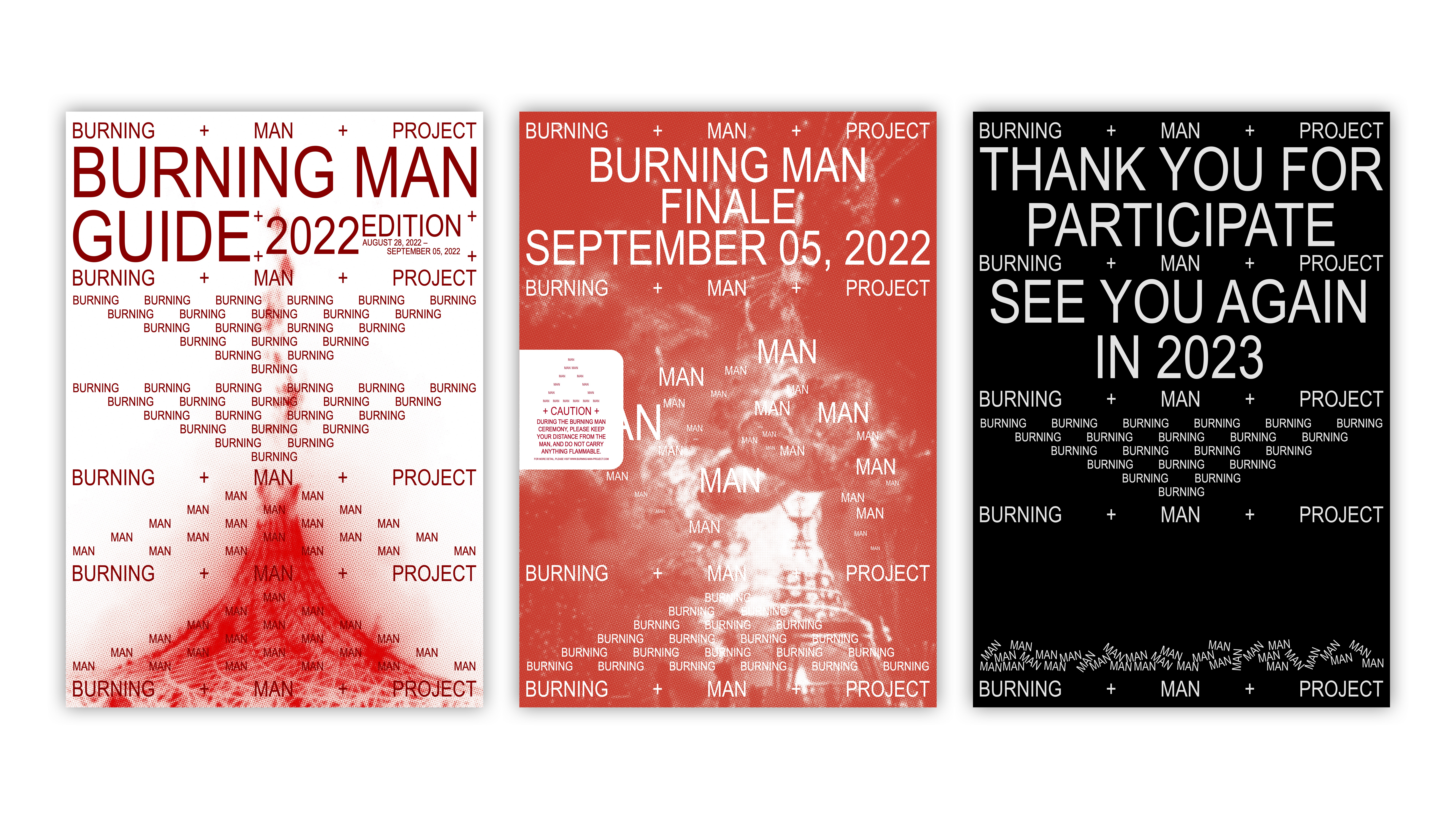
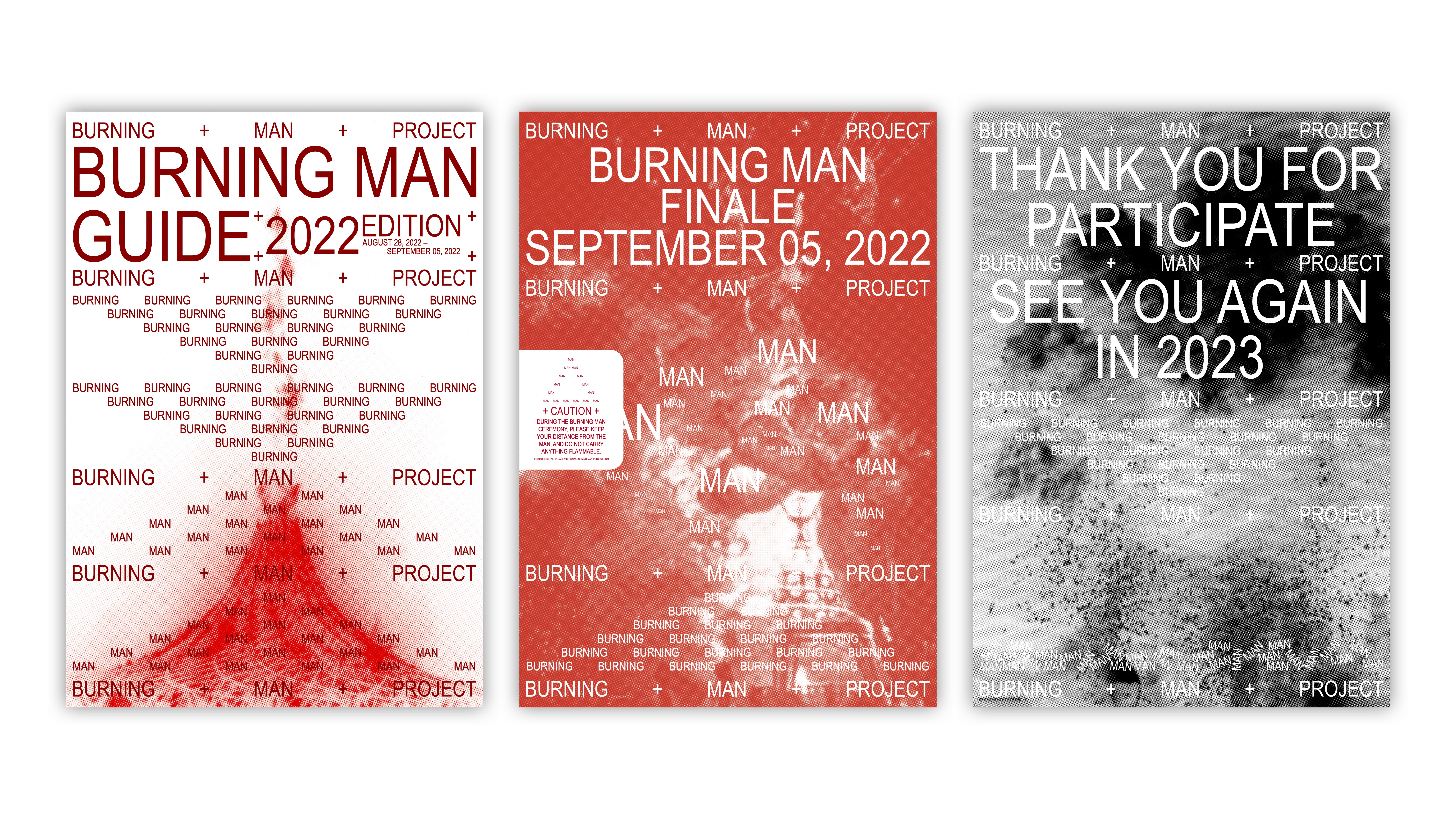
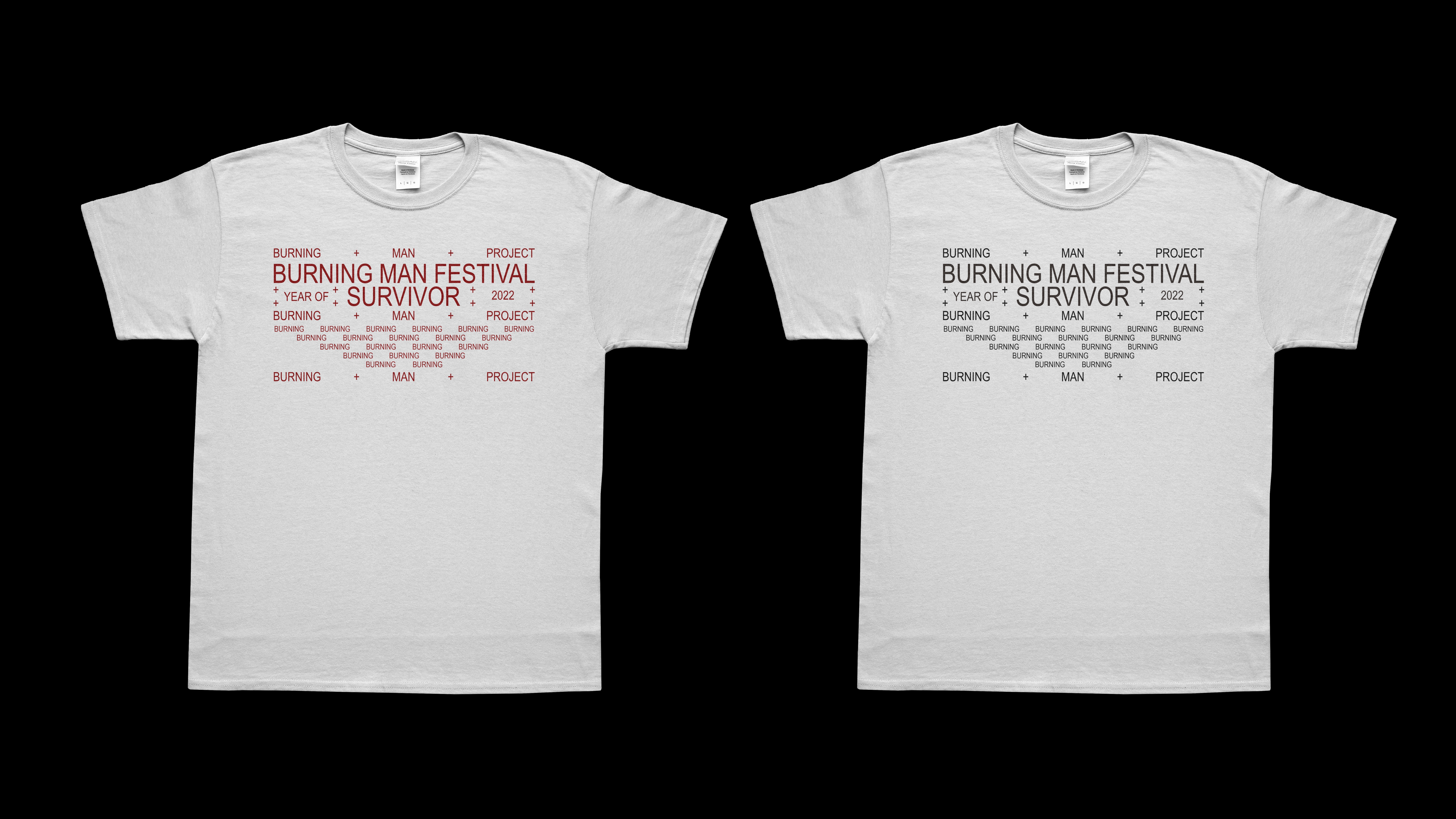
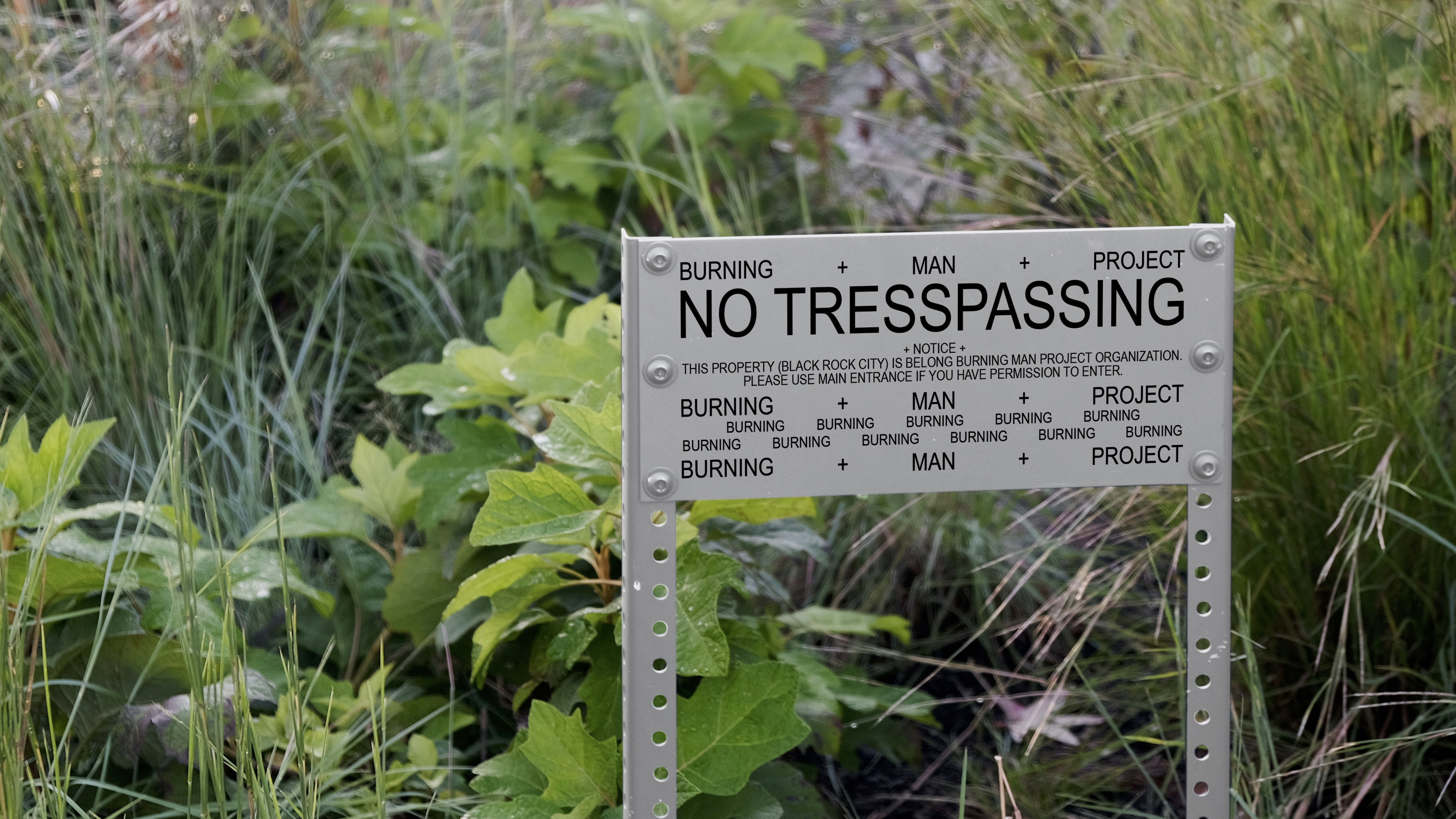
BURNING MAN is an event that holds in Black Rock City in Nevada. This week-long event encourages participants to express their individuality and creative collaboration in the formation of an artistic community. On the last day of the event, they burn the ‘Man’, which is an enormous size of the statue. The meaning and intention behind burning this man can be very subjective, but most people think that as a point where people leave all behind and move on to the next stage of their life. For the graphic, fully typographic system, I brought their core idea of the event, which is respecting each and everyone’s individuality and creativity which we can also see in their formation of the community, they are so beautifully divided, but also connected and becomes one as a community. And the keyword for this concept is ORDER and CHAOS. The sentence ‘BURNING + MAN + PROJECT’ at the top middle and bottom works as the framework of this whole system, and anything inside of this frame is filled with individuals in an orderly, but sometimes very chaotically.
INSTRUCTOR: JOSEPH HAN